Mobile Web: Logical Pixel vs Physical Pixel
Usually you don’t want to do this, but in a rare occasion, sometimes you want to be able to have a web page that is logically as wide as the physical pixels of the browser, especially on the mobile devices. In this situation, one CSS pixel (px) will be exactly one physical pixel as depicted on the screen.
The usual trick to fit the content into the viewport is by using the de-facto viewport meta tag, first popularized by iPhone and now widely support in many other mobile browsers. Those who design web sites optimized for mobile view are familiar with this technique. For example, the following will fix the width to the phone or tablet browser width and the user can’t scale (via pinching or menu buttons) at all:
<meta name="viewport" content="width=device-width initial-scale=1 maximum-scale=1 user-scalable=no">
After Apple introduces higher-density screen, widely hyped as the retina display, the situation slightly changes. For compatibility with existing sites, the above trick still works. However, the content is simply scaled (in this case, twice). This means, a web page with the above viewport setting will still report 320 (px) as the screen.width (and window.innerWidth, not surprisingly) even on iPhone 4. Note that iPhone 4’s screen resolution is 640 x 960.
In order to detect the ratio between the device pixels and the logical pixels, there is window.devicePixelRatio. In the context of iOS, the value is 2 for a device using retina display, otherwise it is 1.
Now let’s consider Android. It does not come as a surprise that the above viewport meta is also supported. When Android-based phones with higher resolution started to be available in the market, compatibility with iPhone-targeted web sites via this trick needs to be retained. However, for phones with resolution like 480 × 800, it is not an integer multiple of 320 (for the width). In this case, window.devicePixelRatio will have the value of 1.5.
Effectively, to reach 1:1 ratio of CSS pixel and physical pixel, we just need to compute the actual device width by multiplying window.devicePixelRatio with window.innerWidth and then adjust the viewport dynamically. The goal I’ve set for my experiment is however slightly more challenging: how can I do that without dynamic viewport modification unless it is absolutely necessary?
Fortunately for Android, we can do that rather easily, i.e. by customizing the scaling via another new setting: target-densityDpi. This was something specifically implemented for Android (see the corresponding commit).
Now let’s give it a try.
First of all, since Apple devices with retina display are arguably the most popular ones, let’s optimize for that use-case. We do that by setting the scale upfront to 0.5:
<meta name="viewport" content="width=device-width initial-scale=0.5 maximum-scale=0.5 user-scalable=no">
For Android, we apply the density DPI approach and now it becomes:
<meta name="viewport" content="width=device-width target-densityDpi=device-dpi
  initial-scale=0.5 maximum-scale=0.5 user-scalable=no">
Non-retina display is somehow still popular, e.g. iPad and previous generation of iPhone. To cater those users, we need to reset the scale back to 1 so that the viewport is not falsified (i.e. twice as large). We would do that by a simple JavaScript code (executed via window.onload):
if (window.devicePixelRatio === 1) {
    if (window.innerWidth === 2 * screen.width ||
        window.innerWidth === 2 * screen.height) {
        el = document.getElementById('viewport');
        el.setAttribute('content', 'width=device-width target-densityDpi=device-dpi ' +
            'initial-scale=1 maximum-scale=1 user-scalable=no');
        document.head.appendChild(el);
        width = window.innerWidth;
        height = window.innerHeight;
        if (width === 2 * screen.width) {
            width /= 2;
            height /= 2;
        }
    }
}
In the above, when checking the ratio between window.innerWidth and screen.width, apparently we need to check screen.height as well. This seems counterintuitive, however it is necessary because on iOS, screen.width and screen.height values are not swapped when the device switches orientation (landscape, portrait).
The Harmattan web browser in Nokia N9 (and N950) has this peculiar behavior where (after modifying the viewport) window.innerWidth and screen.width are not properly updated. Hence, we need additional check for that and adjust the values (that division by 2) ourselves when necessary.
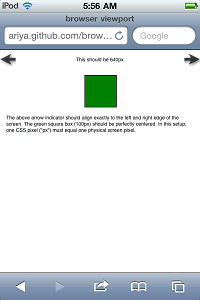
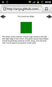
For an online test case, go to ariya.github.com/browser/viewport. If everything goes well, there should be two arrows (position:absolute) which point exactly to the left and right edge of the screen, respectively. It also shall report the screen width in physical pixels, something you can verify with the device specification. There is a perfectly square box, 100 × 100, which should be centered properly.
Using few devices I could test (iPhone, Nexus S, N950, iPad, Playbook, and TouchPad), the above strategy seems to work well. The proof lies in the following screenshots.
Note how this trick is still missing some tweaks. For example, switching orientation (portrait to landscape or vice versa) is not taken care of, it is left as an exercise for the brave reader. Even reloading the web page after orientation change does not always solve the issue (somehow the viewport settings are sticky in one way or another). Due to the complexity and different ways viewport is handling in different devices, bear in mind that this whole technique might not be 100% future-proof.
This is my endeavor so far and if you have a better alternative trick, please do share!


