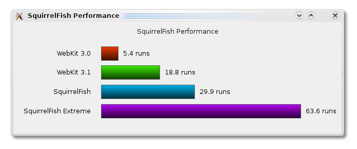
Let us start with a screenshot:
The graph itself is not something new, since I just recreated SquirrelFish Extreme comparison (against its predecessors). The focus is actually the tool which was used to generate that bar chart.
For the code and a little explanation, check out what I wrote on Qt Labs on the topic of
