Optimizing CSS3 for GPU Compositing
Modern web browsers can leverage the ubiquitous graphics processing unit (GPU), both in mobile and desktop, to accelerate page rendering. This is particularly suitable for popular CSS features such as animation, transition, opacity, transformation, and many others. Web developers however need to ensure that all the bits and pieces work well to achieve the ideal 60 frames per second.
Let us take a look at the following Spinning Cube example, it combines 3-D transformation with keyframed animation. You can try the live demo, which will give something like the following (animated GIF, pardon the quality):
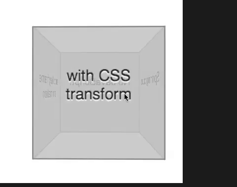
This example is a perfect case for the browser to perform GPU compositing. The browser will capture the DOM elements associated with every side of the cube and map them as textures residing on the GPU (you can think of a texture as a rectangular area containing the pixel values). Each side will get its own texture, thus in this demo we will have four textures. This process of capturing the pixels and sending them as textures only needs to be carried out once, i.e. at the very beginning right before any animation starts.
What happens in each animation frame? There is no need for an expensive rendering, drawing those texts in a 3-D perspective. The browser will compute the necessary 3-D matrix to transform the existing textures so that each of them gets projected in the right way. The process repeats in a series of infinitesimal steps, hence the user gets the impression that the cube is rotating.
In the old days, when the possibility of GPU compositing did not exist, this entire animation will be quite costly. For every tick, the browser (via the underlying graphics stack) needs to continuously draw the text on each side with a different projection matrix, hardly a trivial task especially on platforms with limited speed and power.
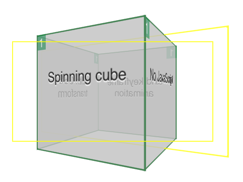
One important key aspect of a successful GPU compositing is the optimal amount of texture upload. In our example above, the text never changes and hence the browser needs to do the capturing and texture mapping only once. How do we debug it? It is quite easy if you use Safari on OS X. First, run this command in a terminal:
defaults write com.apple.Safari IncludeInternalDebugMenu 1
and then relaunch Safari. You’ll have an extra menu Debug. Pull that menu to go to Drawing/Compositing Flags menu item and then ensure that Show Compositing Borders is checked. Restart Safari. Now if you visit the spinning cube demo again, Safari (via WebKit) will display some extra information. You will get a colored border for every DOM element which gets its own layer and thus mapped as a GPU texture. However, the most important thing here is the number displayed in the corner. It indicates how many time the content of the layer has been updated. Each update is a possibly expensive operation since it involves the transport of pixels to the GPU.
To minimize the amount of texture uploads, you can only animate or transition the following properties: opacity, transform, and filter. Anything else may trigger a layer update. For example, check the example codepen.io/ariya/full/xuwgy that changes the background color of a box gradually between green and blue. You can add more and more boxes, at one point the whole animation feels really really sluggish. If this is running on a smartphone or a tablet, the browser will stop responding, in some cases eventually it will crash. Viewing this example from Safari:
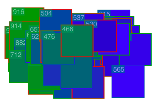
As you can witness, the high numbers on the corner of every box are scary. The browser is busy recreating the content for that layer because the color has changed. For every step, this results in tons of pixels being pushed to the GPU. This exhausts both the memory bus to the GPU and the video memory of the GPU. It is a classic case of non-optimal GPU compositing and no amount of translate 3-D can solve this problem.
While the choices of animated properties seem to be quite limited, this doesn’t mean the end of the world. In fact, if it is done carefully, the combination of opacity and transformation is sufficient to create some impressive effects. For some inspiration, check out demos like three.js Periodic Table, Photon CSS Lighting, FPS View, Montage MovieShow (shown below), and many others.
Taking advantage of GPU acceleration is more than just blindly applying the “translate 3-D” incantation. Remember, a sport car does not give you a guarantee that you reach your destination faster than someone else, you are still at the mercy of the traffic situation. Making sure that the traffic between the CPU and the GPU is not congested is the key to help the browser hits the optimal balance.

Addendum
For a more comprehensive take on this subject, refer to my previous talk Fluid User Interface with Hardware Acceleration (read the slide deck, watch the 28-min video on YouTube). There I also explained the workaround (read: hack) if you still insist on background color animation. Some other related articles you might want to read: