On Hue Subdividision for Mortals
The use of HSV/HSL color space is obvious when we need to have several colors distributed in an optimal way, colors as unique as possible. For example, SpeedCrunch uses it to autogenerate the colors used for the syntax highlighting feature. The details behind its algorithm was already described by Helder in his Qt Quarterly article Adaptive Coloring for Syntax Highlighting. Basically we use the color wheel and subdivide the hue into equal parts. Primary additive color components are red, green, and blue. This distributes the colors in maximum angular distance with respect to the hue values.
So far so good. However, it was known that human eyes are generally more sensitive to green than other colors. In computer graphics, this is often manifested in the grayscale function, i.e. the function that converts RGB to a grayscale value. Take a peek at Qt’s qGray(), it gives the red, green, and blue the weighting factors of 11, 16, and 5, respectively. Shall we take this into account when we subdivide the hue?
If this theory holds, it actually means that a change of shade in the green region should give more perception of change to our eyes then e.g. the same change of shade in the blue region. Another way to say it: the same amount of color difference (to our eyes) corresponds to different angular distances (in the hue component, in HSV/HSL color space) in the green and blue region. Hence, if we want to subdivide green, we can have a smaller spacing there compared to the case where we want to subdivide blue. A simpler way to do it would be to stretch the green region so that it is wider than blue. That way, we just subdivide the color wheels with equal spacings and overall we still get more contributions from green than other components. This is illustrated in the following picture. It will be more “human-friendly”, won’t it?
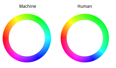
Here is a detailed explanation. Suppose a (in the range 0..1) denotes the angular distance relative to a reference. For the purpose of this analysis, assume a=0 means red, 0.333 means green, and 0.667 means blue. This is a 1:1 mapping to the the normalized hue value (in HSL/HSV color space). It is exactly what is shown in the “Machine” version of the color ring in the above picture. On the right, the “Human” version, a=0.333 still means green, same for 0 (red) and 0.667 (blue). However, we see that the yellow color (roughly marks the transition between red and green) is in a different position, same for cyan and magenta. Overall, the coverage area of green is larger, analog to (like previously described) 50% contribution of the green component to the grayscale value. This means that the mapping between a and hue gets more complicated.
A simple solution is to have a custom interpolation between red and green, green and blue, and blue and red. In the case of “Machine”, any value a between 0 and 0.333 corresponds to a linear combination between red and green, and thus the middle point (yellow) sits at a=0.167. For the “Human” version, this is not the case anymore. The distance between yellow-red and yellow-green has a proportion of 11 and 16. Thus, yellow sits at a=0.136. If we continue for green to blue and blue to red in a similar fashion, we will arrive at the complete mapping between a and hue.
I decided to take another route. After few minutes experiment with different curve fitting methods, here is an interesting mapping function:
hue = (1.39 - a * (4.6 - a * 4.04)) / (1 / a - 2.44 + a * (0.5 + a * 1.77));
that is exactly the one I used to produce the image of the color rings above. You still need to take care of avoiding divide-by-zero (or rewrite it to avoid division: left as a 5-minute exercise to the curious reader), but otherwise the function is smooth and fast enough to execute on modern machine. Isn’t math cool?
Of course, take this with a pinch of salt: likely I make a lot of gross approximation and model simplification.
Personally I still doubt that this will make a big difference. Afterall, you can hardly distinguish two saturated colors when they have a hue distance less than 0.1. They just look the same, unless we play with the saturation and value. We can even attack it from a different point view: since a bit of shade of green provokes our eyes more than blue and red, should not we shrink the green region instead, and thus effectively reducing its contribution? Or maybe we need to use the concept with a different approach? Or let us just forget it and use subtractive color model instead?
Comments? Ideas? Flames?